Pie Chart

Table Of Contents

🎬 Math Angel Video: Pie Chart Concept, Formula, Examples

What is a Pie Chart?

A pie chart divided into four sections, labelled 40%, 25%, 20%, and 15%, representing different category contributions.

⏩️ (0:01)

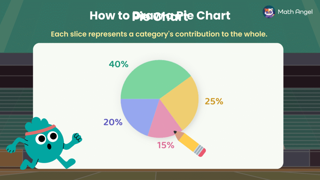
🛎️ What is a Pie Chart?

A pie chart is a circular chart that shows how a whole is divided into parts.

Each slice represents a category. The size of the slice shows the proportion that category contributes.

❇️ Key Characteristics of Pie Charts:

  • The total of all slices is 100%.
  • Each slice shows one category only.
  • Bigger slice = bigger proportion.


🛎️ Why Use Pie Charts?

  • Show how something is divided
    e.g. How a student’s time is spent in a day: sleeping, school, sports

  • Compare different parts of a whole
    e.g. Favourite school subjects: Maths, Science, English, Art

  • Spot the biggest or smallest category fast
    e.g. Which pet is most popular in a class: dogs, cats, birds, fish

How to Draw a Pie Chart?

Pie chart of favourite sports of 100 students, football (40%), basketball (25%), swimming (20%), and tennis (15%). Central angle formula is displayed.

⏩️ (0:25)

To draw a pie chart, you need to turn data into angles.

Step 1: Use the formula to calculate central angles:

$$
\text{Central Angle} = \left( \frac{\text{Frequency}}{\text{Total Frequency}} \right) \times 360^\circ
$$

SportFrequencyCentral Angle
Basketball25(25 ÷ 100) × 360° = 90°
Football40(40 ÷ 100) × 360° = 144°
Swimming20(20 ÷ 100) × 360° = 72°
Tennis15(15 ÷ 100) × 360° = 54°
Total10090° + 144° + 72° + 54° = 360°


Step 2:
Always check your angles add up to 360° and your percentages add up to 100%.

Step 3: Use a protractor to mark each angle carefully.

Step 4: Label each slice with the sport and percentage.

How to Read a Pie Chart?

A visual guide on how to read a pie chart, with a formula for calculating category counts.

⏩️ (2:20)

A pie chart doesn’t just show you percentages, it can also help you work out actual numbers and find hidden data.

🛎️ Formula to Find the Frequency (Count) of a Category:

$$
\text{Count of the Category} = \left( \frac{\text{Central Angle}}{360^\circ} \right) \times \text{Total Count}
$$

🛎️ Pie Chart Example: 

We are given favourite Pizza Toppings of Students:

  • Pepper = 90°, corresponding to 20 students.
  • Mushroom = 162°
  • Ham = 36°
  • Pineapple = unknown


1) How many students took the survey?

We’re told that 90° represents 20 students (Pepper).

  • Use the formula:

$$
\frac{90^\circ}{360^\circ} \times \text{Total} = 20
$$

  • Solving for Total:

$$
\text{Total} = 80 \text{ students}
$$

2) How many students prefer ham topping?

  • Ham = 36°, total students = 80

$$
\frac{36^\circ}{360^\circ} \times 80 = \frac{1}{10} \times 80 = 8 \text{ students}
$$

3) What percentage of students like pineapple?

  • Pineapple angle is calculated as:

$$
360^\circ – 90^\circ – 162^\circ – 36^\circ = 72^\circ
$$

  • The percentage of students who prefer pineapple:

$$
\frac{72^\circ}{360^\circ} \times 100\% = 20\%
$$

🍪 Quiz: Practice Reading and Interpreting Pie Charts

Membership Required

You must be a member of Math Angel Plus or Math Angel Unlimited to view this content.

Join Now

Already a member? Log in here

🎩 Stuck on Pie Charts or Data? Try AI Math Solver

Need math help? Chat with our AI Math Solver at the bottom right — available 24/7 for instant answers.

12 Comments
5 2 votes
Article Rating
guest
12 Comments
Newest
Oldest Most Voted
Inline Feedbacks
View all comments

Leave a Comment

Your email address will not be published. Required fields are marked *