Line Graphs and Curve Graphs
Table Of Contents
🎬 Math Angel Video: Line Graph vs Curve Graph
What is a Line Graph?
⏩️
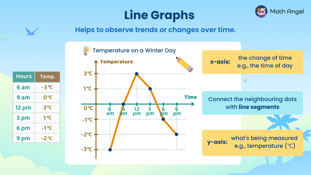
🛎️ Definition of Line Graphs:
A line graph is a way to display data points over time by connecting them with line segments, making it easy to visualise trends and changes.
🛎️ Key Features of Line Graphs:
- X-axis: Represents the independent variable, usually time (e.g., time of day).
- Y-axis: Represents the dependent variable, showing what is being measured (e.g., temperature in °C).
- Data Points: Each point marks a recorded value at a specific time.
🛎️ How to Draw a Line Graph:
Follow these steps to draw a line graph correctly:
- Draw the axes:
- Label the x-axis with the time or category (e.g. hours of the day).
- Label the y-axis with what is being measured (e.g. temperature in °C).
- Plot the points:
For each pair of values, place a dot where the two values meet.- At 6 am, the temperature was –3°C.
- At 12 pm, it peaked at 3°C.
- At 9 pm, it dropped to –2°C.
- Join the dots:
Connect the neighbouring points with straight lines to show how the data changes. Add a title:
Give your graph a clear title that explains what it shows, e.g. “Temperature Changes During the Day.”
🛎️ Why Are Line Graphs Useful?
Line graphs clearly show how values change over time, making them useful for analysing trends and making predictions (e.g., temperature, stock prices, population growth).
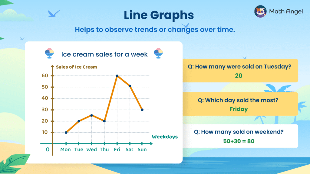
Line Graph Practice (Ice Cream Sales)
⏩️
Line graphs show how data changes over time.
Each point represents a value, and the line shows the trend:
- when it goes up, values increase;
- when it goes down, values decrease.
🛎️ Practice Reading Line Graphs
The graph shows ice cream sales for a week.
Q: How many were sold on Tuesday?
A: 20.
➜ Find Tuesday on the x-axis. The point is at 20 on the y-axis. This means 20 ice creams were sold on Tuesday.Q: Which day sold the most?
A: Friday.
➜ The point for Friday is the highest on the graph, so that day had the most sales.Q: How many were sold on the weekend?
A: 50 + 30 = 80.
➜ Add Saturday (50) and Sunday (30) because those are the weekend days.
What is a Curve Graph?
⏩️
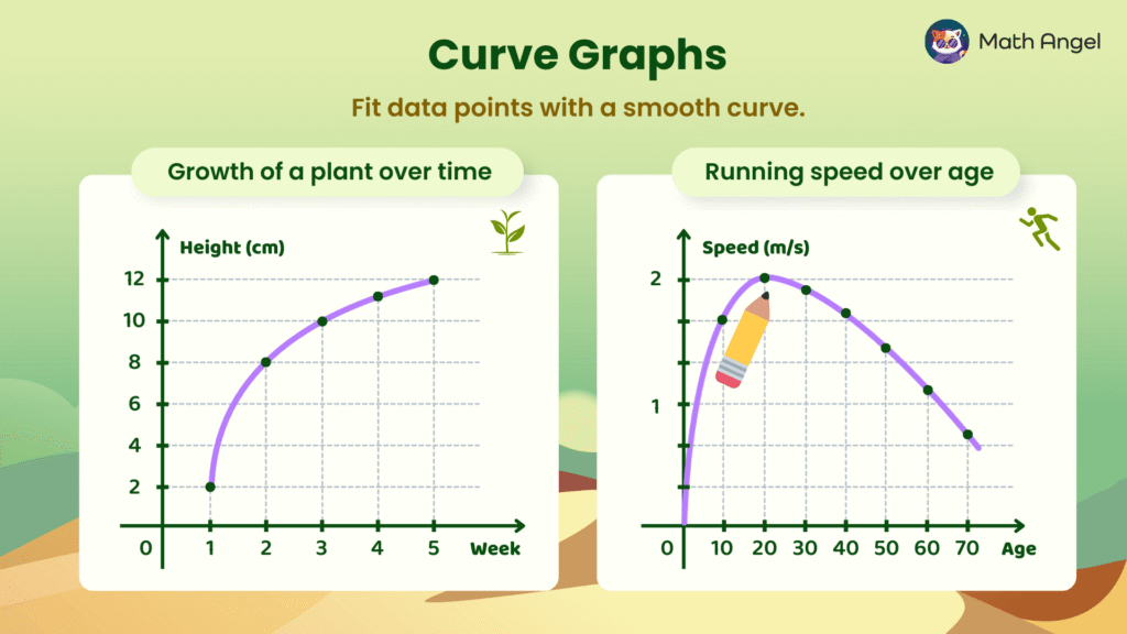
🛎️ Definition of Curve Graphs:
A curve graph is a type of graph used to display data points that follow a continuous trend, forming a smooth curve instead of straight line segments.
These graphs help visualiSe patterns of change over time when data does not increase or decrease at a constant rate.
🛎️ Key Features of Curve Graphs:
- Smooth Curves: Unlike line graphs, which connect points with straight lines, a curve graph fits a smooth curve through the data points.
- Non-Linear Relationships: Best used when changes happen at different speeds instead of a constant rate.
🛎️ Examples of Curve Graphs:
- 🌱 Growth of a Plant Over Time
- The height of a plant increases but at a decreasing rate.
- Growth is initially rapid but slows down as the plant matures.
- A curve graph accurately represents this gradual change.
- 🏃♂️ Running Speed Over Age
- A person’s running speed improves as they grow, peaks at a certain age, and then declines.
- The data follows a curved pattern, making a curve graph the best way to visualise this trend.
Comparison: Line Graphs vs. Curve Graphs

⏩️
Both line graphs and curve graphs are used to show trends and changes over time, but they differ in how they connect data points and represent relationships.
- Line Graphs
- Connect data points with straight line segments.
- Best for showing steady or consistent trends over time.
- Curve Graphs
- Fit a smooth curve through data points instead of using straight lines.
- Best for representing more complex relationships where changes do not happen at a constant rate.
🍪 Quiz: Test Your Skills with Line and Curve Graphs
🎩 Struggling with Graphs? Try AI Math Solver
Need math help? Chat with our AI Math Solver at the bottom right — available 24/7 for instant answers.